Adapt Images to Screen Width
By default, when adding an image to the event description, the image has the maximum width of the section it is placed in. This looks as expected on the desktop, but on mobile devices, the image may be cropped. To account for this, you can modify the template used by your event or calendar. In the help doc below, we will review how to modify the custom template used by the event to make the images in the description width-adjustable and mobile-friendly.
Creating a Template
-
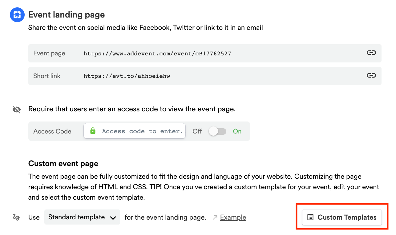
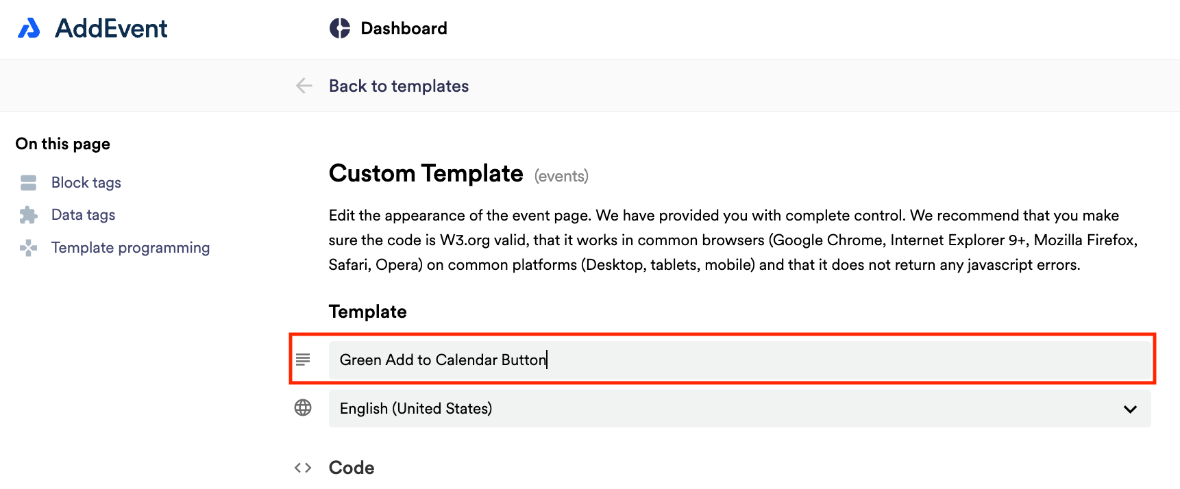
Scroll down to the first sharing method, Event landing page. Create a custom event landing page template by clicking Custom Templates in the app and clicking + New Template. Add a name for the template.
Adapting the images
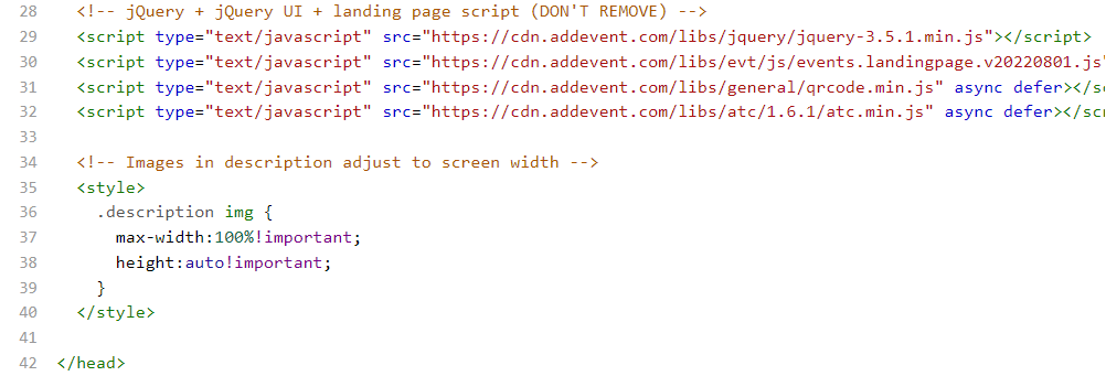
- To make the images in your description width-adjustable, you need to add the following code before the closing head tag in the template code:
<!-- Images in description adjust to screen width -->
<style>
  .description img {
    max-width: 100%!important;
    height: auto!important;
	}
</style>- The result should look like this:
Once the styling code is placed in the template, you can proceed to saving and applying the template.
Applying the custom template to an event
Once all the needed changes are made, you can apply the modified template to any event.
- Navigate to the event page where you want to use the template.
- Scroll down to the Custom event page part of the Event landing page section.
- Select the needed custom template from the dropdown and click Set.
Once set, the template will be used for rendering both the event landing page and the embedded version of the event.
Updated 11 months ago