Color Code Key for Embeddable Calendar
A color coded calendar is visually a nice touch for all of your users, and can add to the look and feel of it's placement in your webpage. A Color coding key is an area that explains to your users what colors correspond to what events. This upgrades your color coding and and makes it more useful, since it allows people to see at a glance what kind of events are on the calendar.
New and Improved Feature!
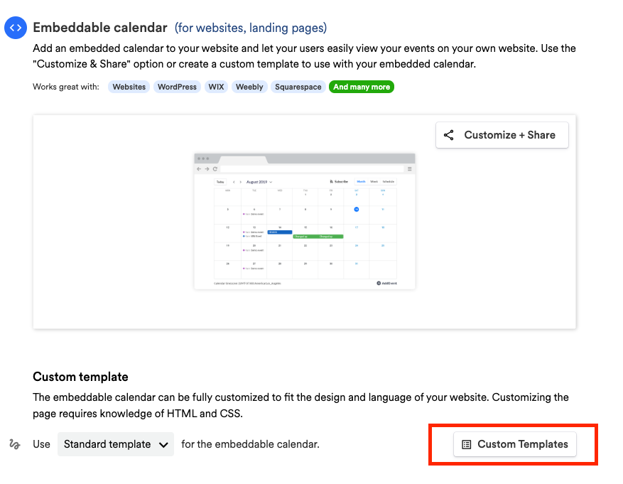
Custom Templates are no longer available in AddEvent 2.0. This is because we've built design templates. Design templates are a no-code feature allowing you to customize your event landing pages, calendar landing pages, and embeddable calendar. Please check out the Embeddable Calendar Landing Page Designs help section for details.
Creating a template
-
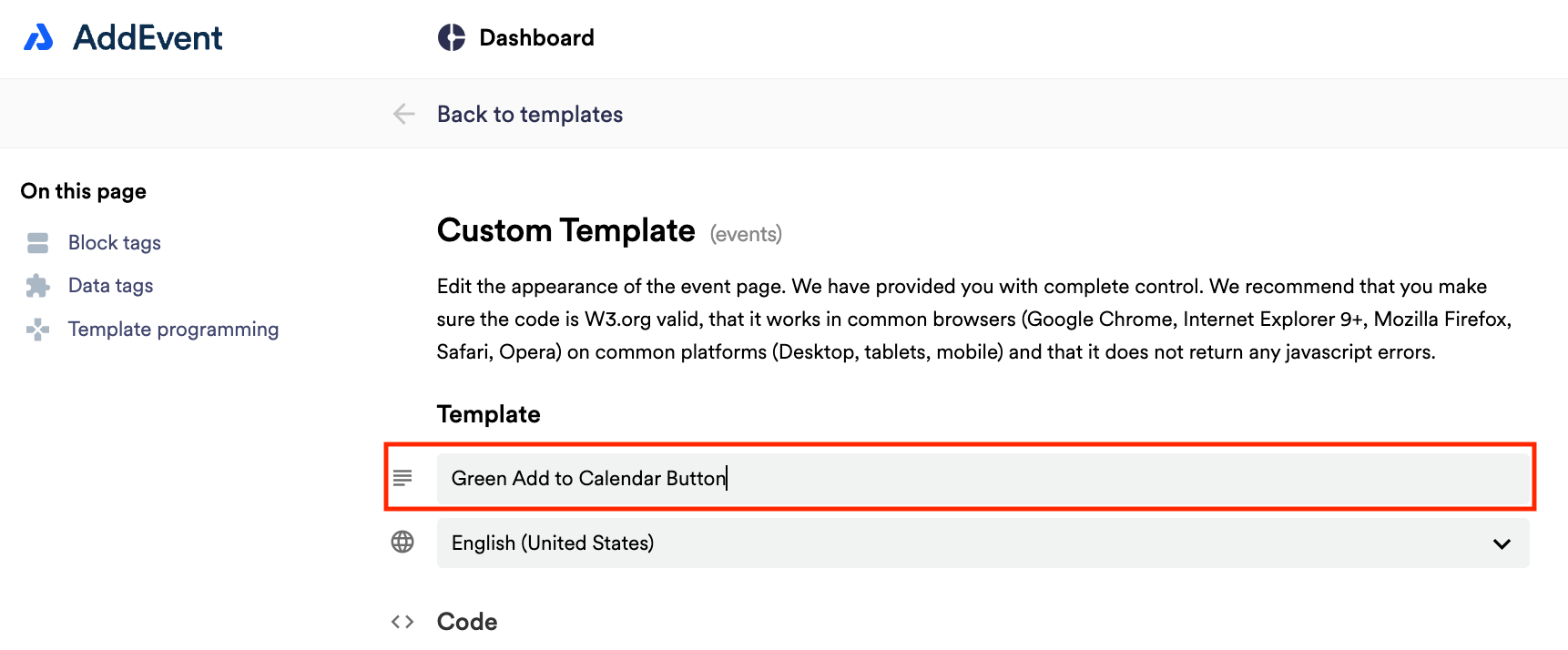
Scroll down to the sharing method, Embeddable. Create a custom event landing page template by clicking Custom Templates in the app and clicking + New Template. Add a name for the template.
Creating the key
This code will generate a series of small circle of color next to the word "Option." The section on changing the settings will walk you through how to modify these colors and options.
-
Add the following code to the header section of your template, just above the
</head>tag:<!-- Color Key Styling --> <style> .color-box { display: inline-flex; align-items: center; border-radius: 8px; } #key { width: 100%; height: auto; margin: 10px 10px 10px 0px; padding: 10px; position: relative; } .color-circle { display: flex; align-items: center; margin: 5px; } .color-circle div { width: 20px; height: 20px; border-radius: 50%; margin-right: 2px; } p { margin: 0; } </style> -
Add the code for the key itself into the template, directly above the
<!-- Details -->comment (on the standard template, this would be at line 242):<!-- Color Key Box --> <div class="color-box" id="key"> <div class="color-circle"> <div class="color1"></div> <p> Option 1 </p></div> <div class="color-circle"> <div class="color2"></div> <p> Option 2 </p></div> <div class="color-circle"> <div class="color3"></div> <p> Option 3 </p></div> <div class="color-circle"> <div class="color4"></div> <p> Option 4 </p></div> <div class="color-circle"> <div class="color5"></div> <p> Option 5 </p></div> </div> -
Save the template
The "settings" of the key
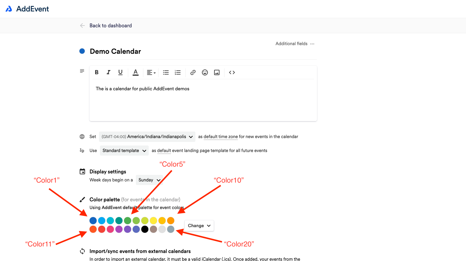
- Each color number (e.g., "color1," "color2," etc.) corresponds to a slot on the embedded calendar's color palette. If you change the colors in the palette, the color key will reflect whatever color is in the color slot, whether default or custom.
- The above code is set up for 5 color/option pairs. To decrease the number of colors, remove a line, to increase the number of colors and options, simply copy and paste another line and update the "color" code and "option" text. (for example:
<div class="color-circle"> <div class="**color5**"></div> <p> **Option 5** </p></div>). - You can change any of the color numbers to be whichever color in your palette you'd like them to reflect. Simply change the color number (example: "color1") to match whatever slot in your palette you want.
- To customize the key according to what each color represents, replace "Option 1," "Option 2," etc. in the template code with the text that will be displayed on the calendar.
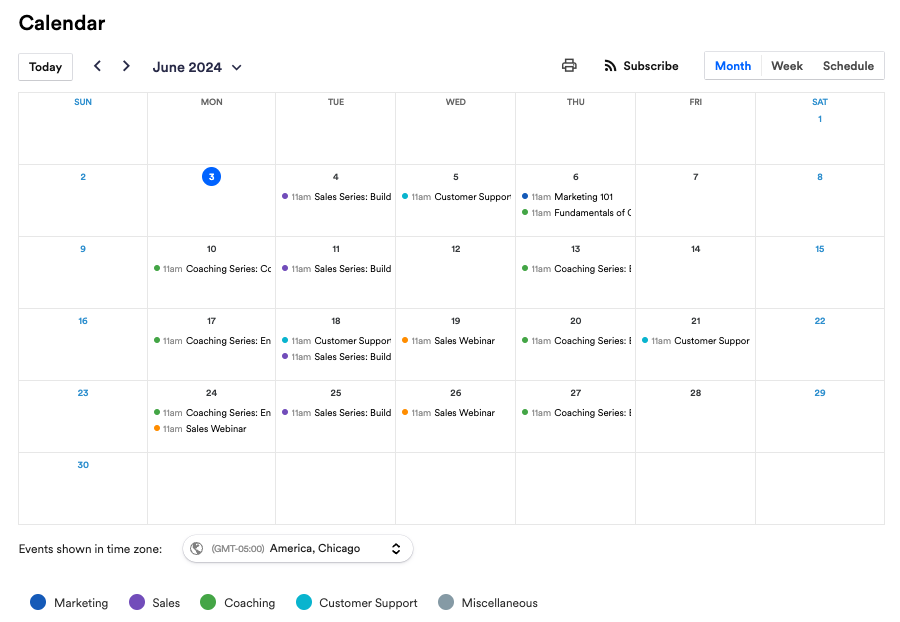
Color key example
Updated 7 months ago