General Tab: Event Landing Page Design Template
The General tab contains settings for layout, images, and colors. Use these options to align your event landing page with your organization’s branding.
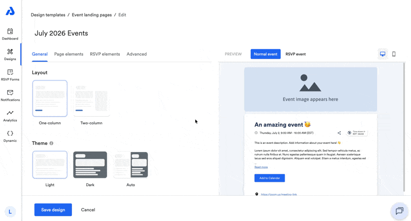
General Settings
Below are available settings within the General tab of the event landing page design.
Layout
You can choose between:
- Single column (default)
- Two-column (side-by-side)
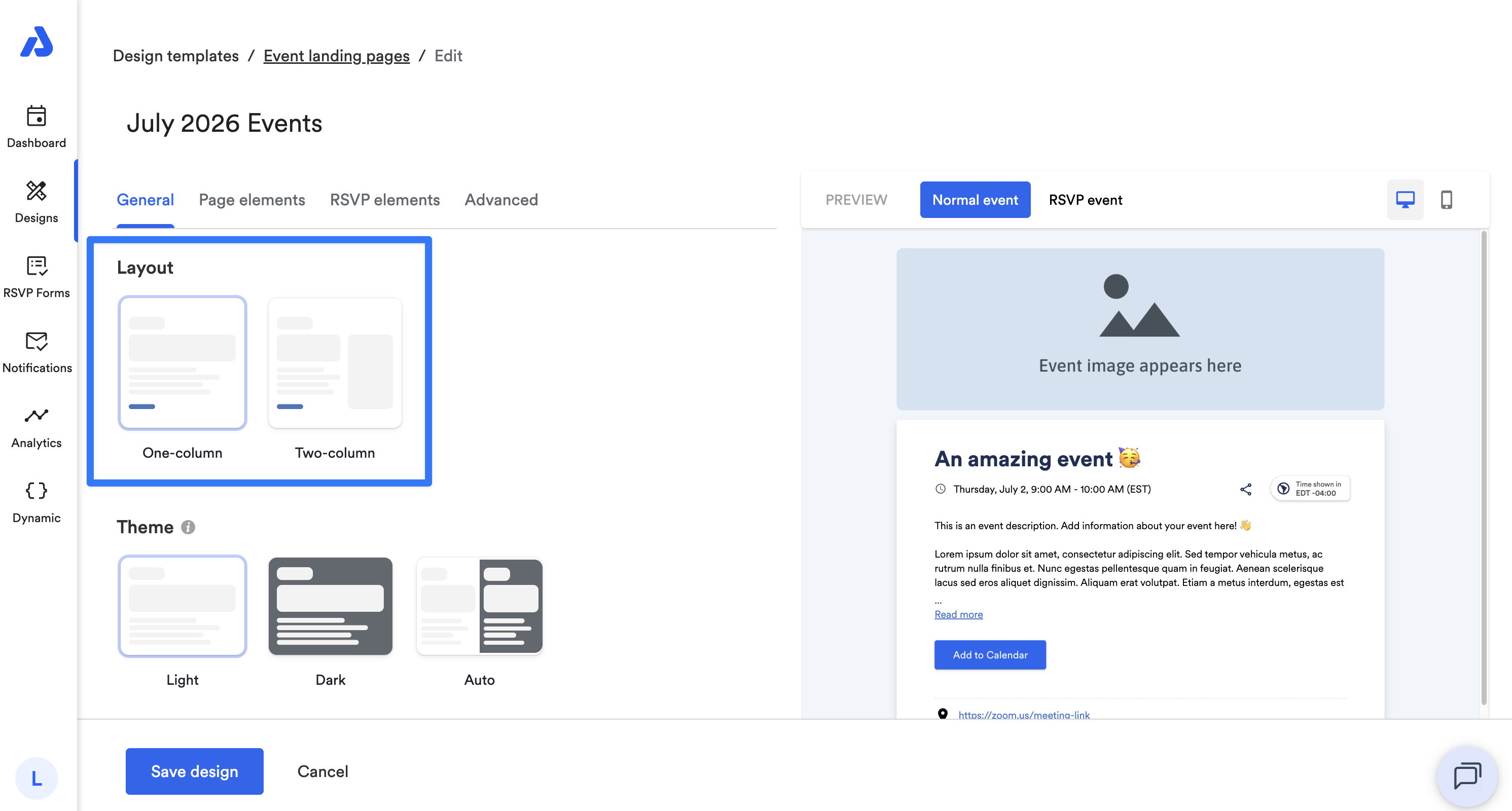
Theme
You can select a color theme for your page:
- Light (default)
- Dark
- Auto: automatically switches between Light and Dark based on the viewer’s device settings.
Note: If the event landing page is set to Dark mode (either set manually or via Auto), the background color, font colors, and link color color settings will be ignored.
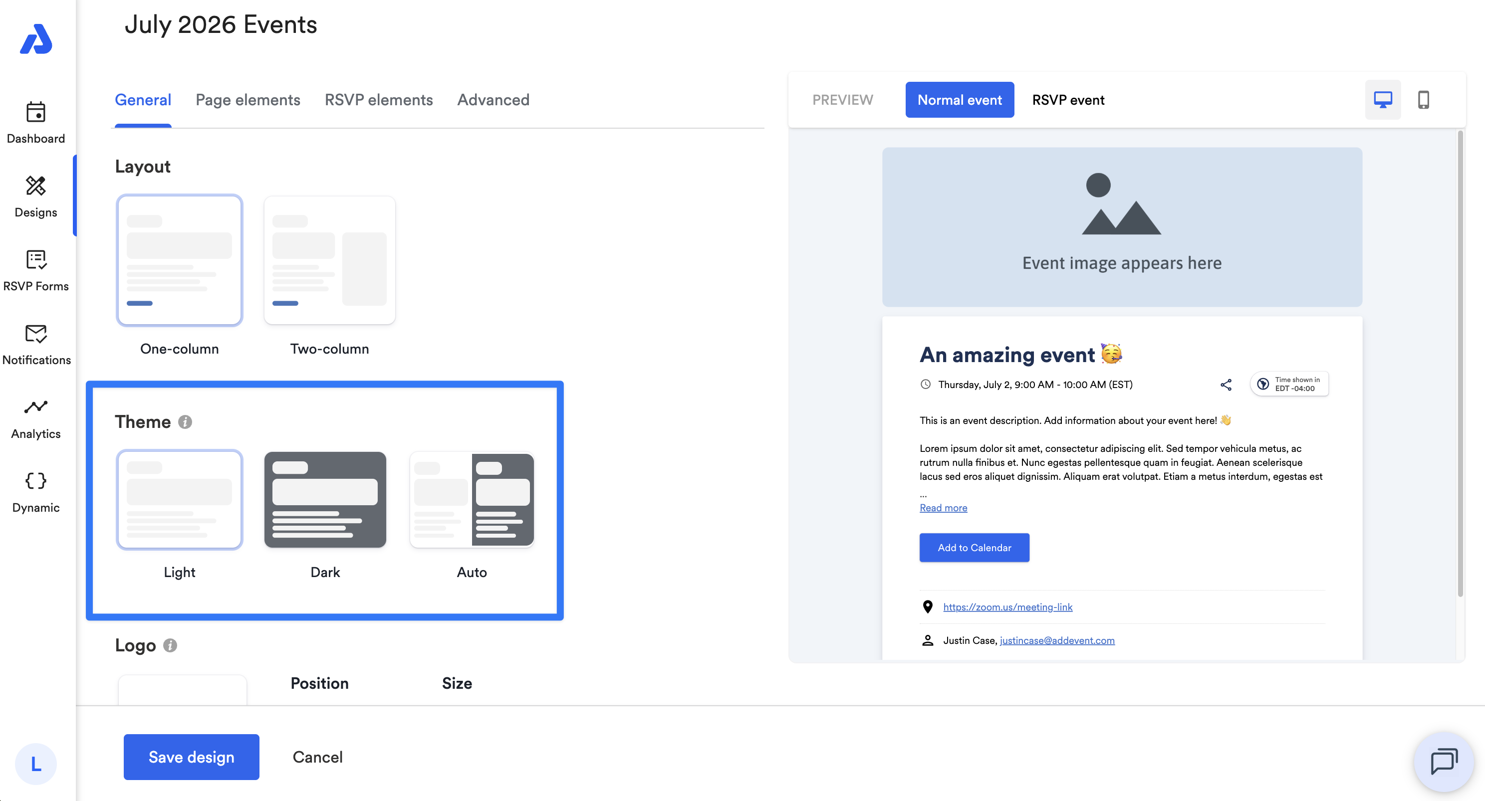
Logo
You can add your organization’s logo to the landing page, displayed above the featured image.
Options:
- Upload an image directly to AddEvent for reuse across all Designs, or provide a publicly accessible URL.
- Position: Align left, center, or right.
- Size: Adjust the logo height (width adjusts automatically to maintain aspect ratio).
- Logo link: When the logo image is clicked, include a URL to direct end-users to.
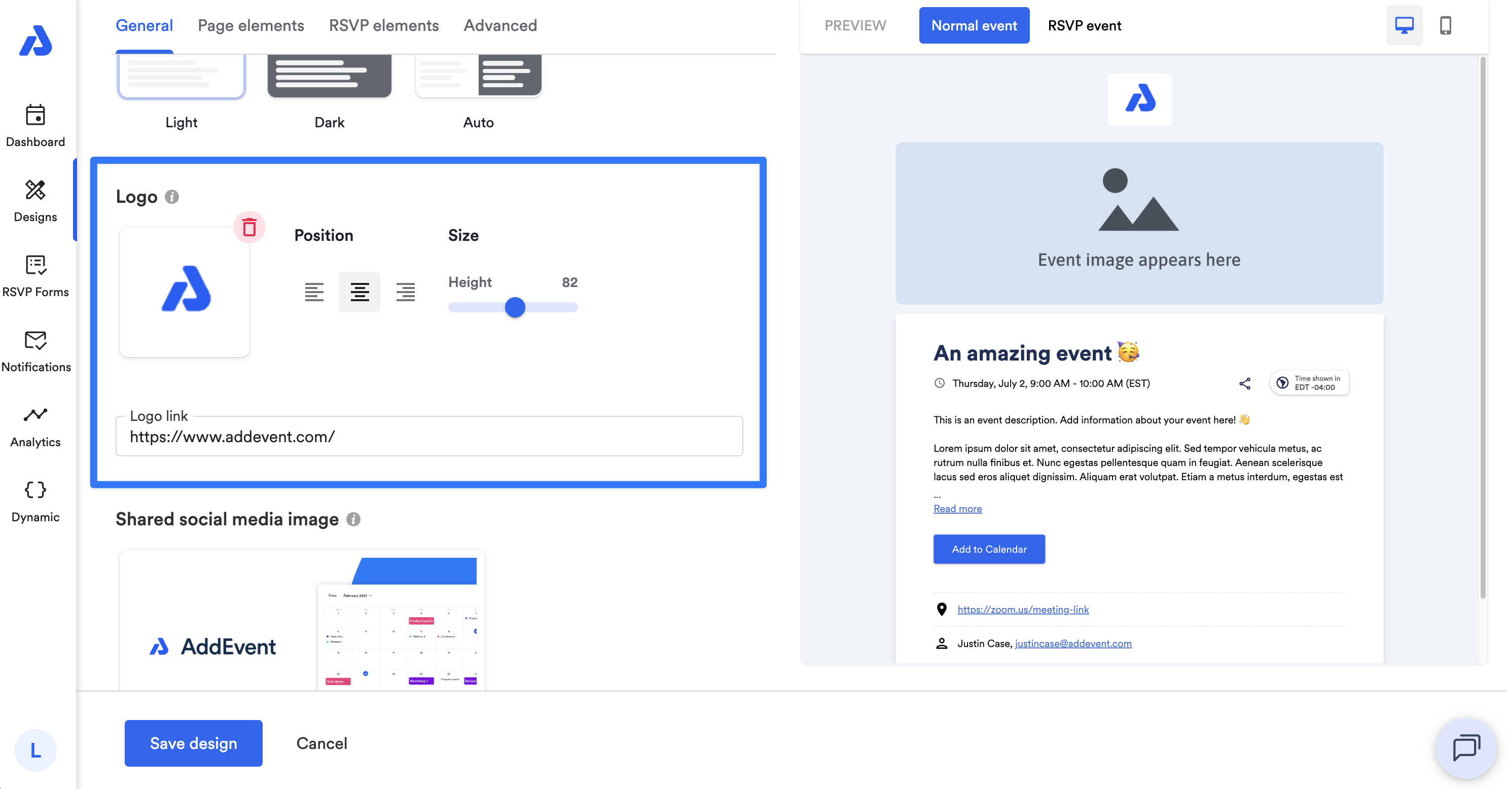
Note: Transparent background images work best.
Preview Images
You can upload an image to display when your event page is shared (e.g., on social media).
Recommended dimensions: 1200 × 630 px (landscape).
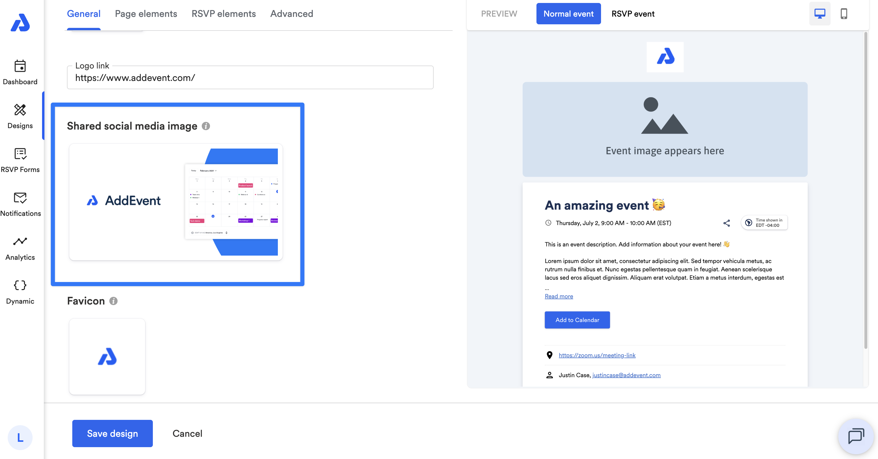
Favicon
You can upload a favicon to display in browser tabs. By default, the AddEvent logo will display.
- Recommended dimensions: 512 × 512 px, square
- Minimum size: 512 × 512 px
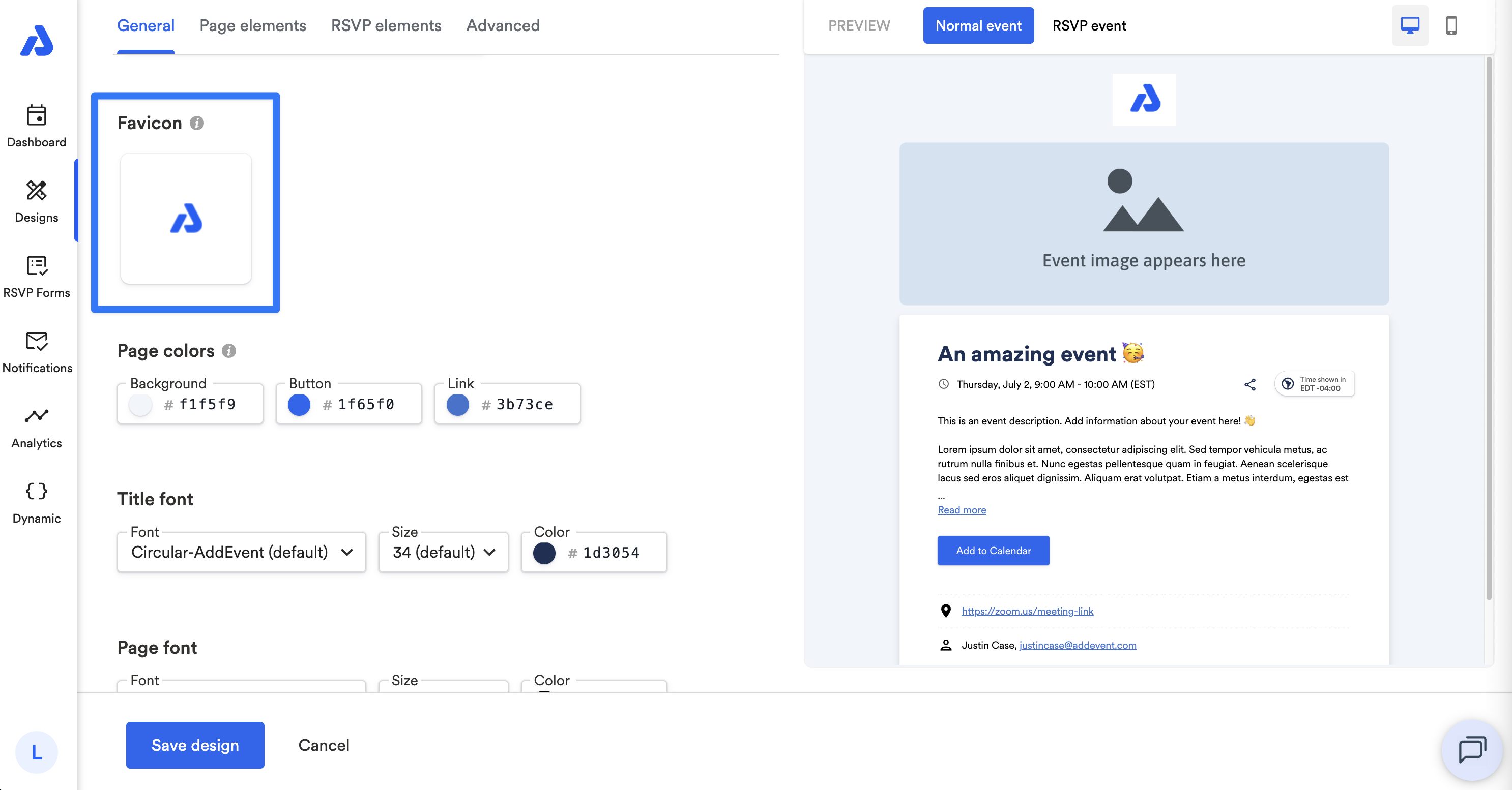
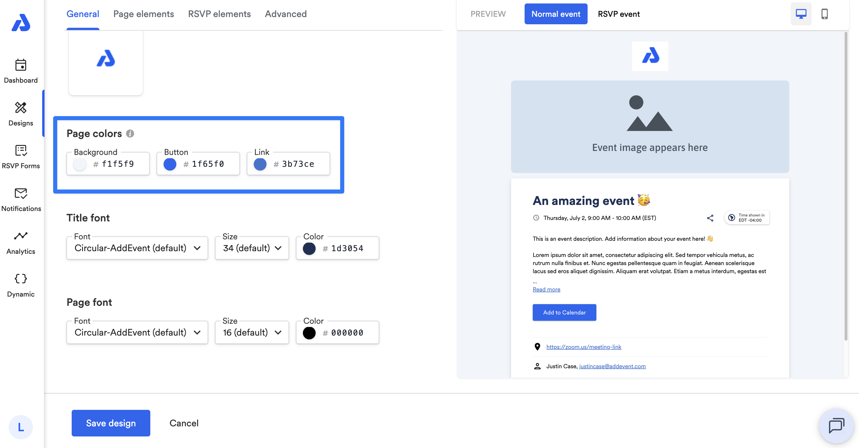
Page Colors
You can customize colors by using the color picker or by entering a hex code for the following:
- Page background
- Add to Calendar button
- Links
Note: Custom colors set here will not be applied when the Theme is set to Dark mode.
The color of the text on your Add to Calendar button is automatically adjusted depending on the button color you apply to it in your design template. The automatic adjustment of the text color is done in order to comply with Web Content Accessibility Guidelines (WCAG).
If you see the color of the text on the button switching to black/white, that's happening when the contrast color no longer complies with WCAG.
Title Font
You can adjust the font, size, and color of the event's title.
- Default font: Circular-AddEvent
- Default size: 34
- Default color: #1d3054
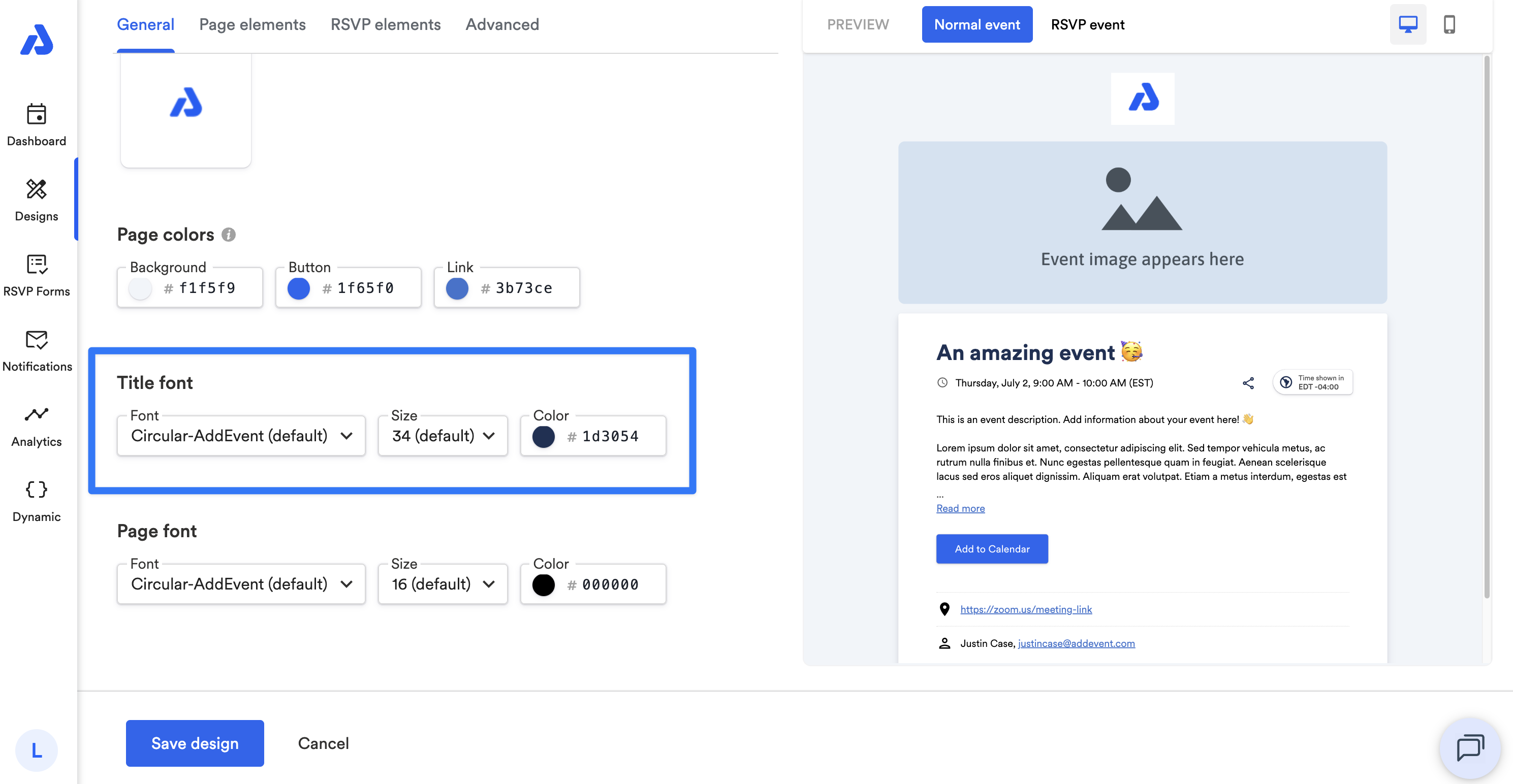
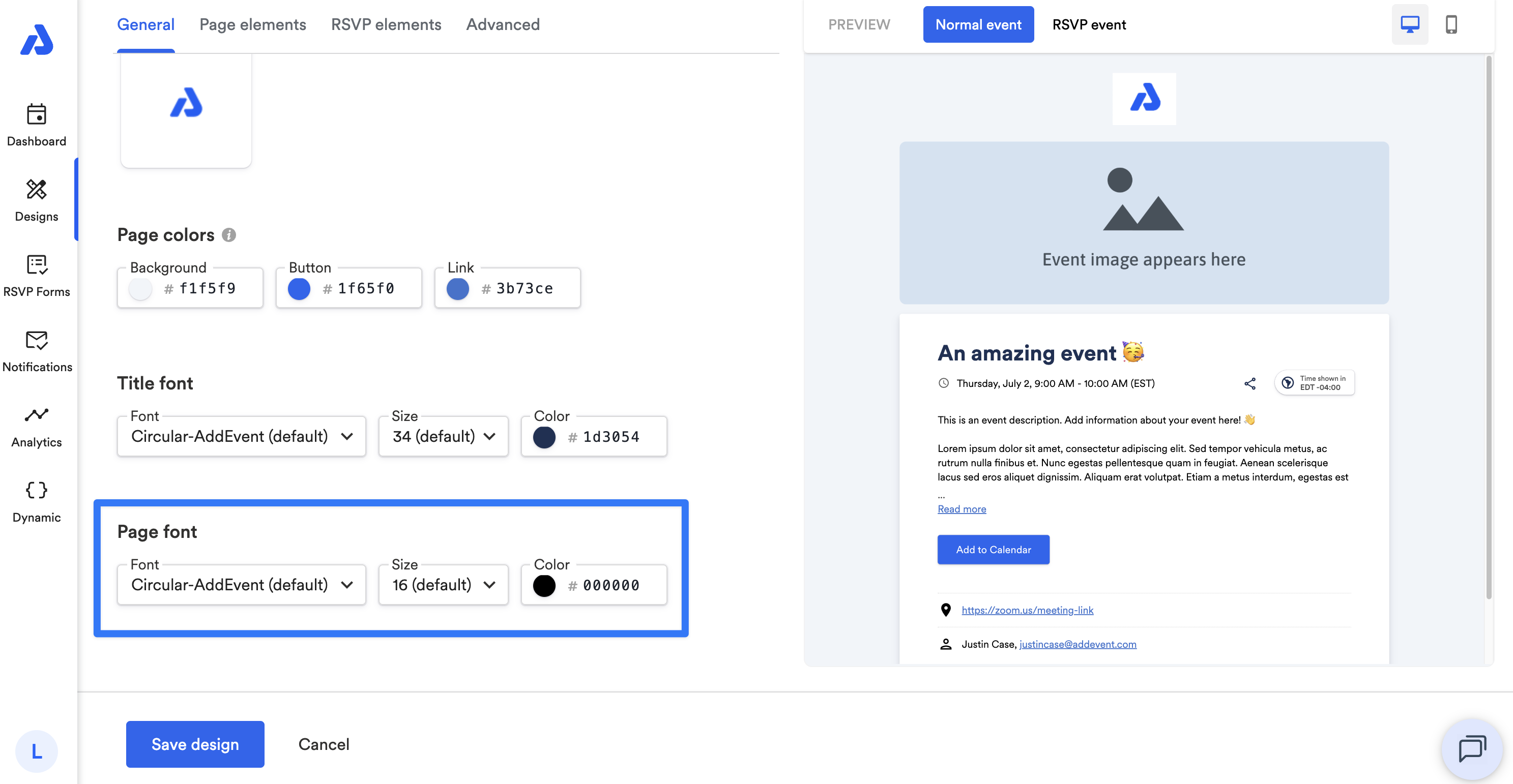
Page font
Adjust the font, size, and color of the body text.
- Default font: Circular-AddEvent
- Default size: 16
- Default color: #000000
Updated 8 days ago