

General Tab: Calendar Landing Page Design Template
The General tab contains settings for the overall layout, images, and colors of your calendar landing page. Use these options to align the design with your organization’s branding.
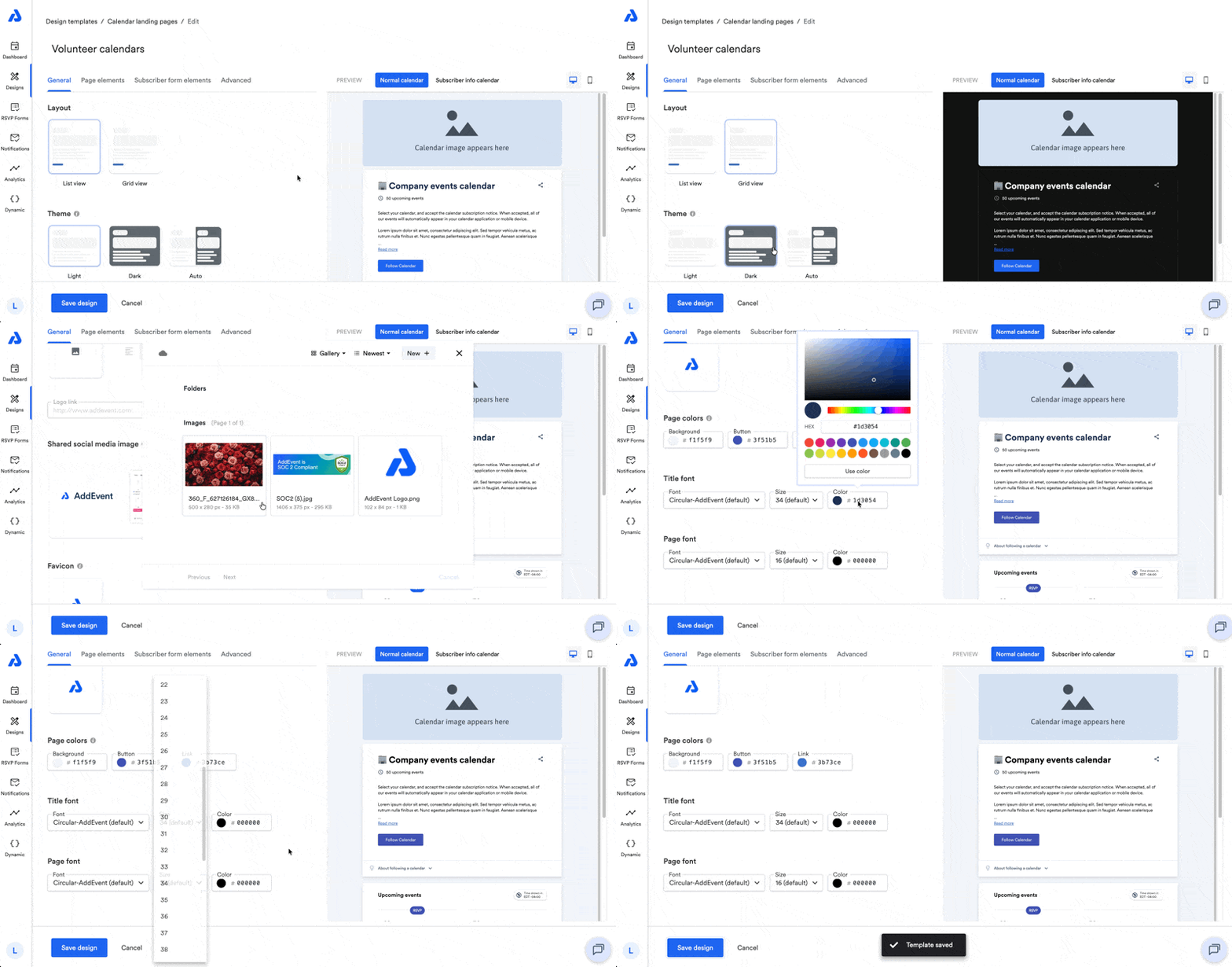
General Settings
Below are available settings within the General tab of the calendar landing page design.
Layout
You can choose how events are displayed:
-
List view
-
Grid view
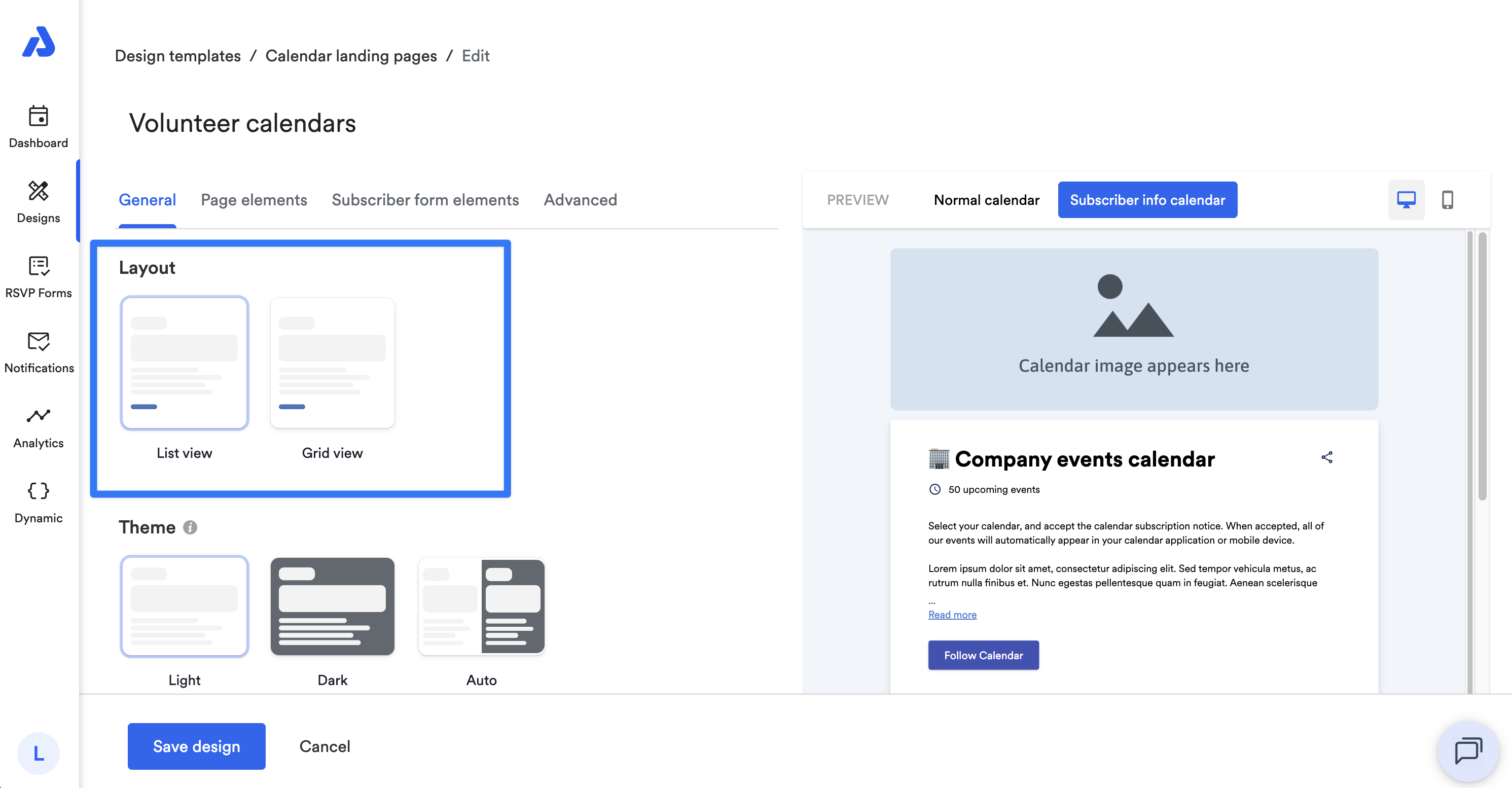
Theme
You can select a theme for the page:
-
Light (default)
-
Dark
-
Auto: switches between Light and Dark based on the viewer’s device settings.
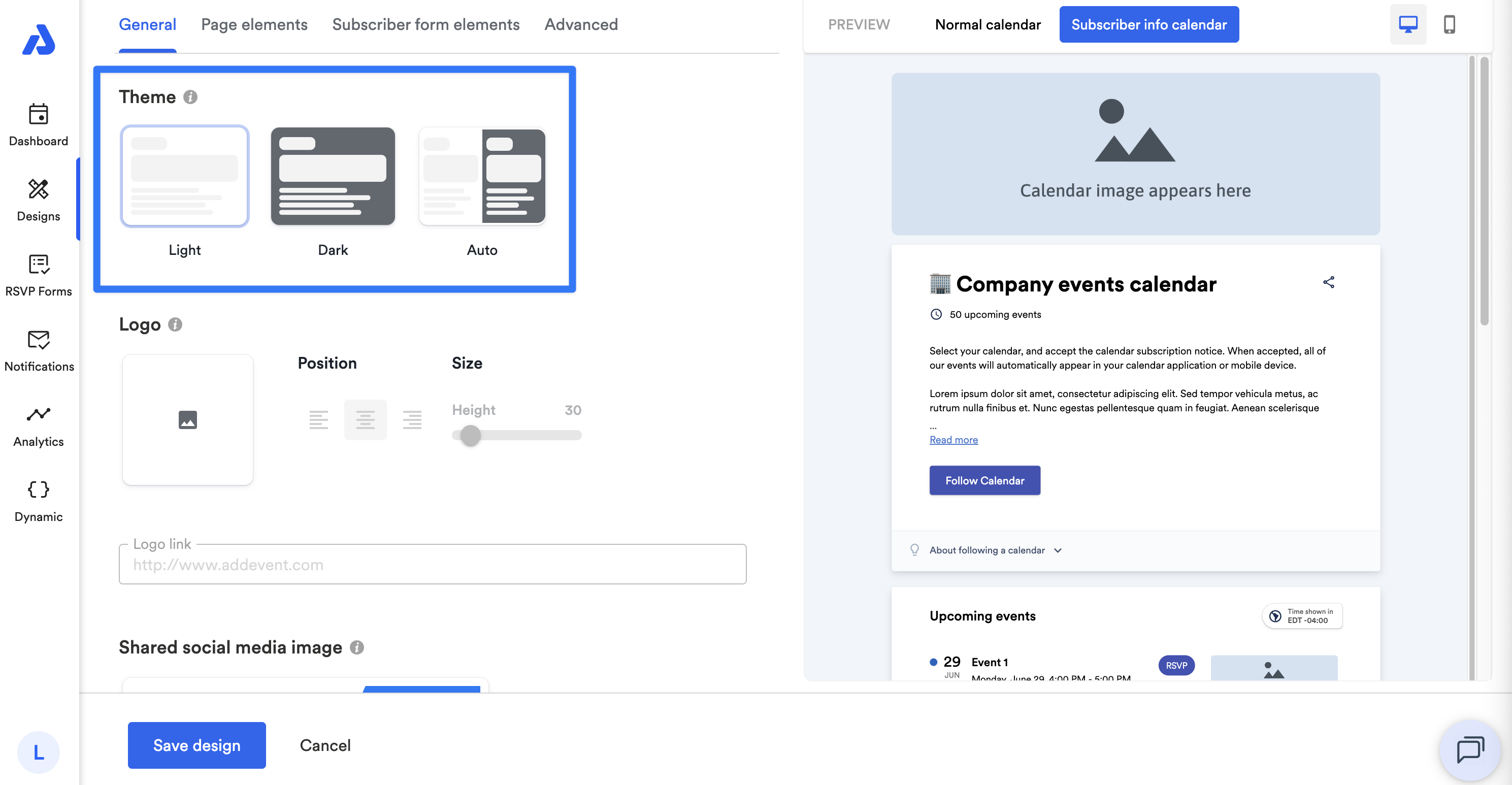
Note: If the calendar landing page is set to Dark mode (either set manually or via Auto), the background color, font color, link color, and title font color settings will be ignored.
Logo
You can add your organization’s logo to the landing page (displayed above the calendar image if one is set at the calendar level). Recommended dimensions are 1200 x 533px.
Options:
-
Upload image: Upload a new file or choose from your image library.
-
Position: Align left, center, or right.
-
Size: Adjust the logo height (width adjusts automatically).
-
Link: Add a URL to make the logo clickable.
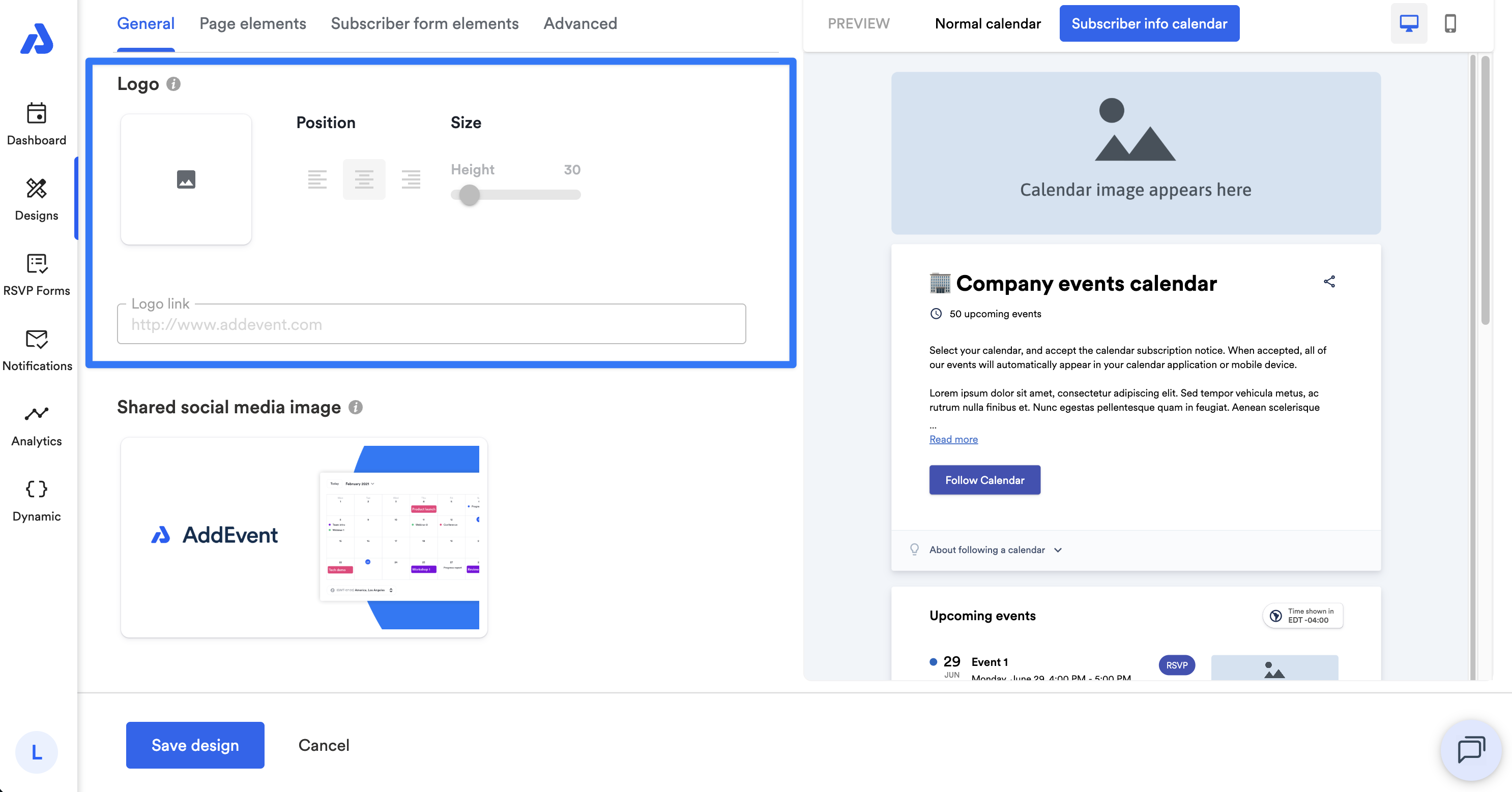
Note: Transparent background images work best.
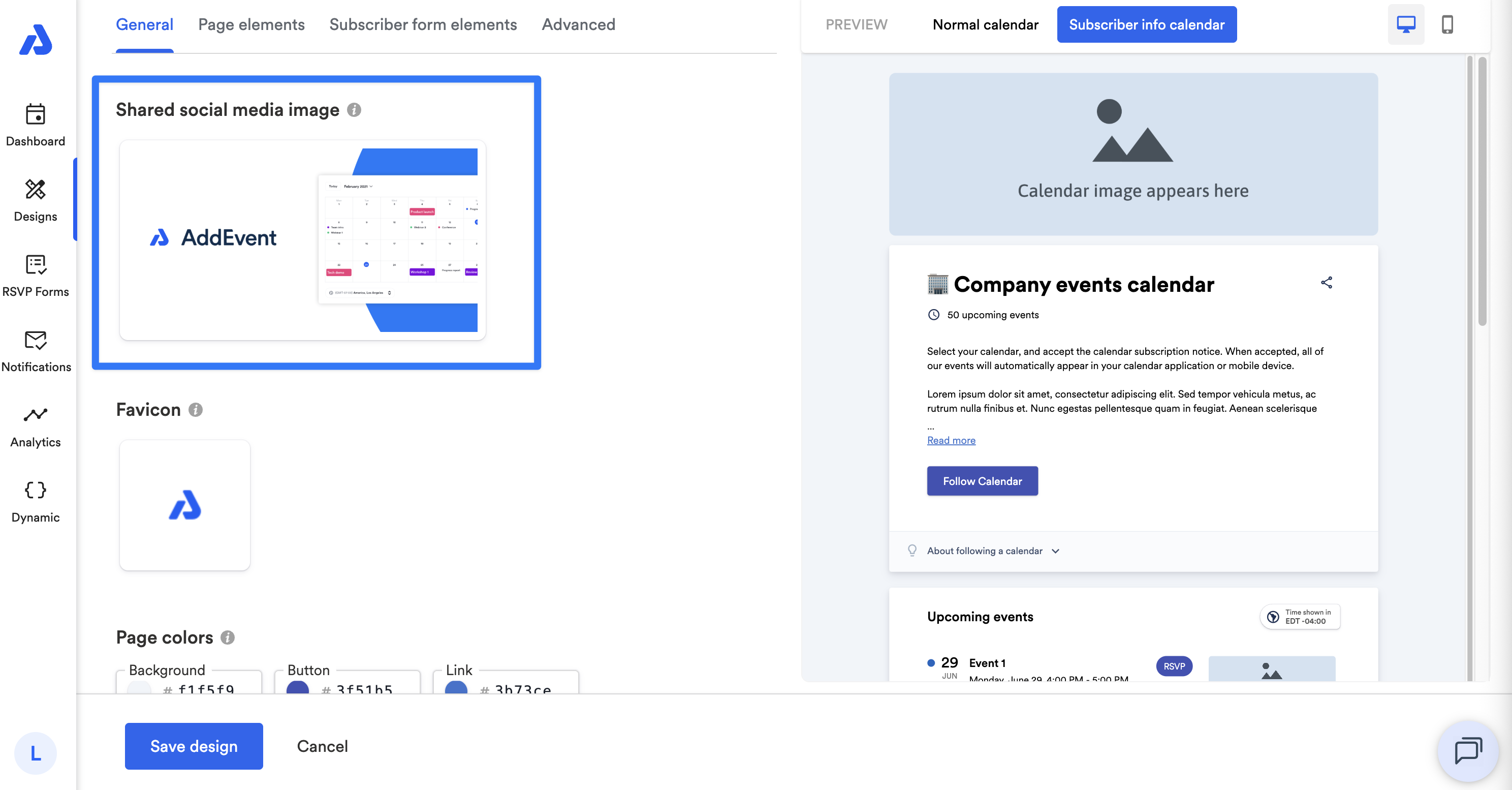
Shared Social Media Image
You can set an image to appear when your page is shared (e.g., in social media posts).
-
Supported formats:
.jpg,.jpeg,.gif,.png,.svg -
Recommended size: 1200 × 630 px (landscape)
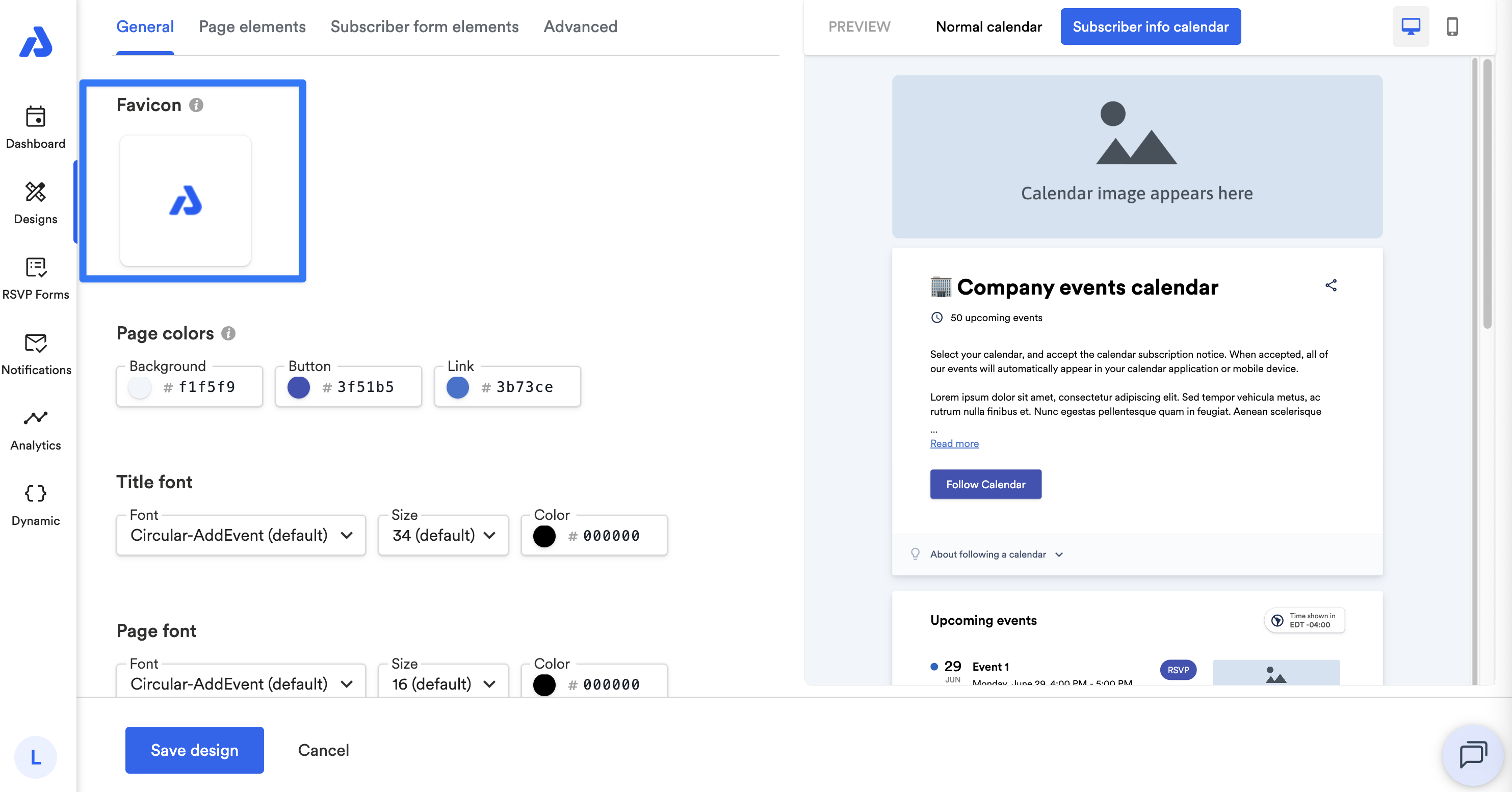
Favicon
You can upload a favicon to display in browser tabs. By default, the AddEvent logo is used.
-
Max file size: 1 MB
-
Recommended dimensions: 512 × 512 px, square
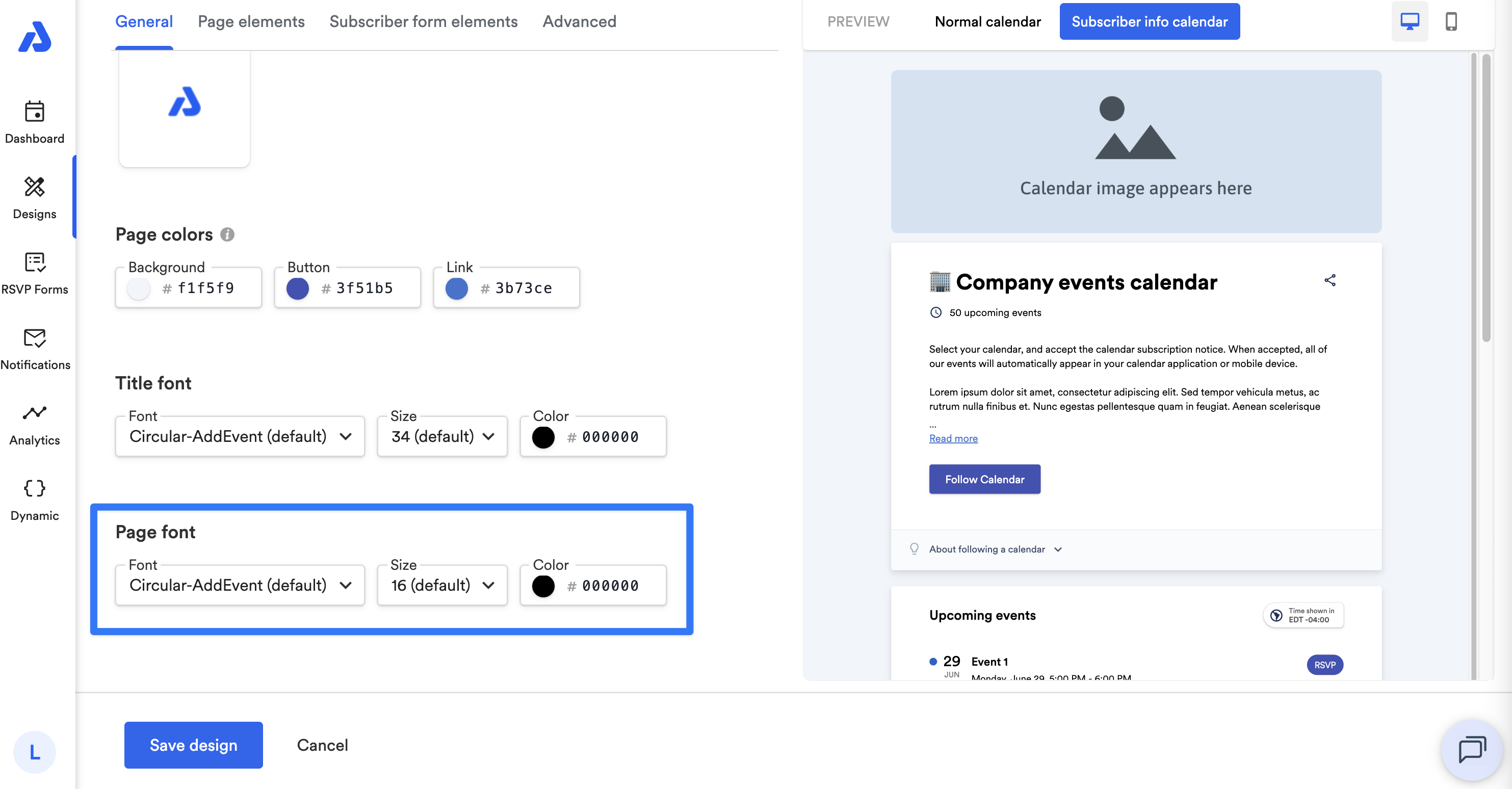
Page Colors
You can customize the colors for:
- Background
- Buttons
- Links
Enter a hex code or use the color picker.
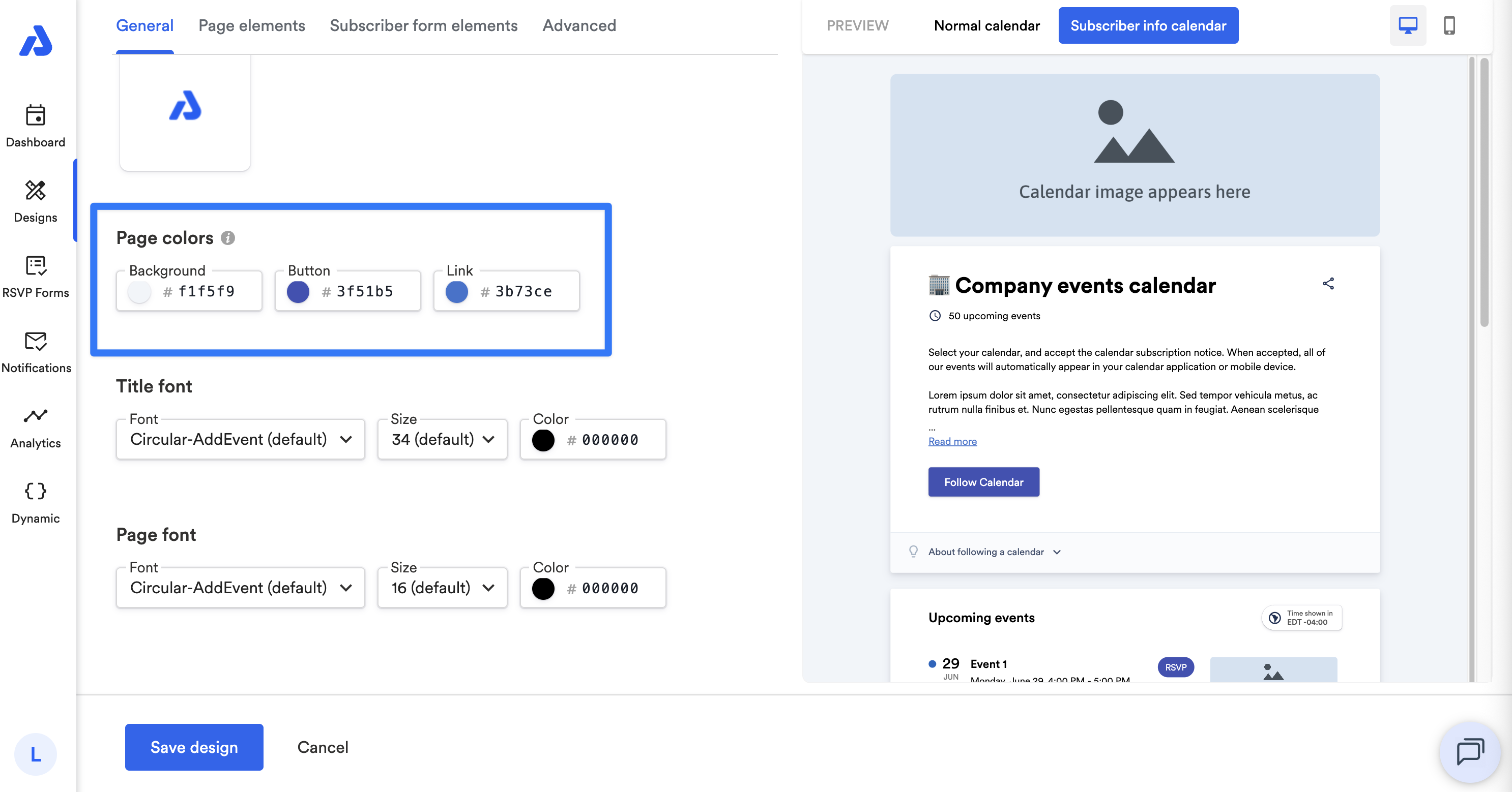
Note: If the Dark Theme is selected, or if the Auto theme applies Dark mode, the background, font, link, and title colors will not be applied.
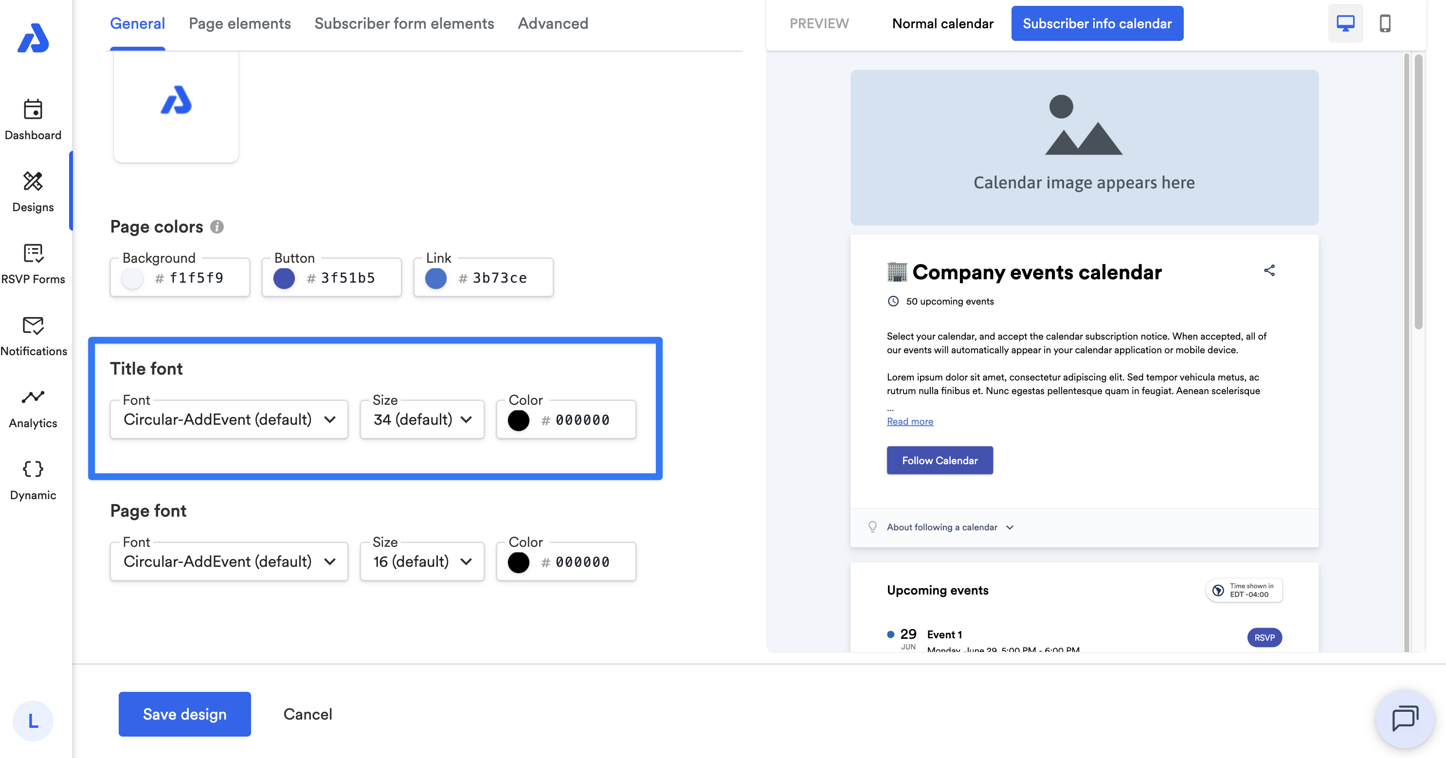
Title Font
You can set the font, size, and color for your page title.
Page Font
You can set the font, size, and color for the body text on your page.
Updated 4 months ago